Canadian Institute for Health Information | Visual Identity Update

-
Refresh CIHI's visual identity by creating a flexible and contemporary graphic system that extends the existing brand—while preserving its core assets, including typography, colour palette, and overall brand recognition.
-
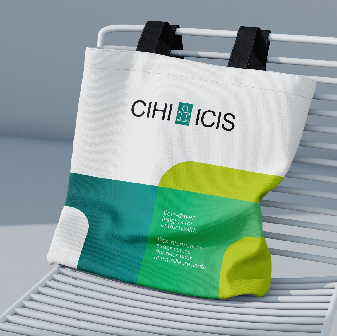
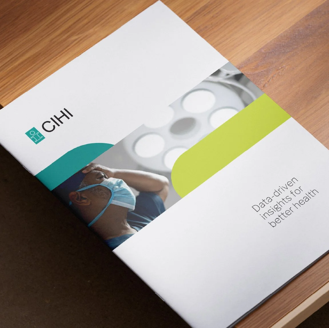
The refreshed brand builds on the organization's established identity by embracing the distinctive "I" shape from the existing logo as its core visual element. Overlapping these forms creates depth, movement, and visual interest, reinforcing the idea of connection and progress while maintaining a strong link to the original brand.
Introducing gradients breathes new life into the existing colour palette, adding movement,, dimension, and a more contemporary feel without losing brand recognition. The result is a modern, flexible visual system that feels fresh and dynamic while remaining unmistakably connected to the organization's established identity.