Canadian Telecommunications Association Rebrand

-
As the Canadian Wireless Telecommunications Association expanded its mandate to represent both wireless and wireline communications, its identity no longer reflected the full scope of the organization. The challenge was to create a modern brand that signals this evolution while retaining the credibility, recognition, and authority established over more than three decades.
-
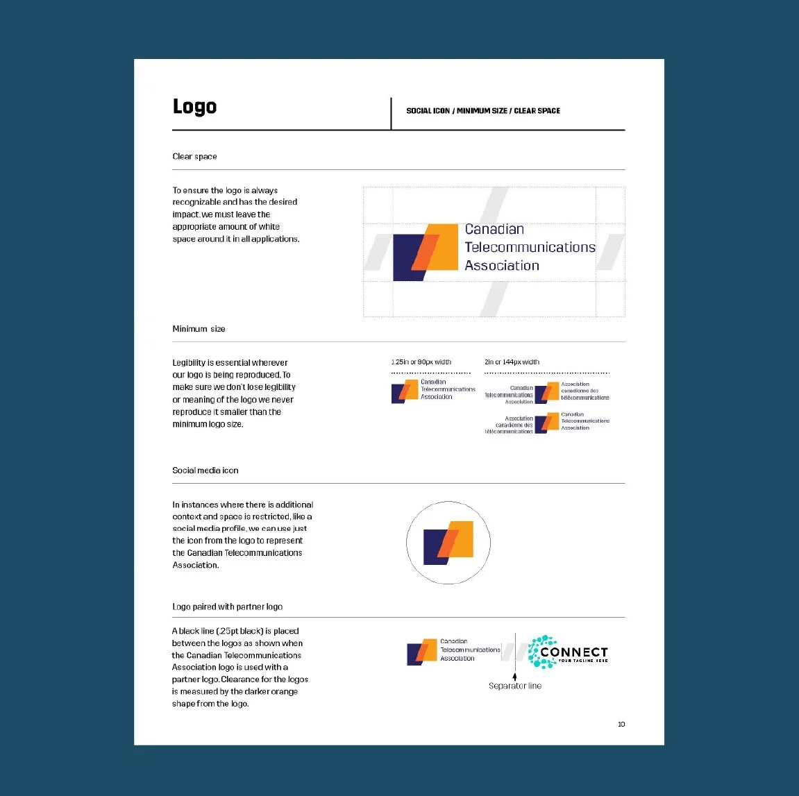
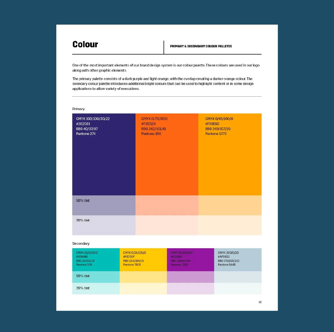
The new logo reflects the organization's evolution from the Canadian Wireless Telecommunications Association to the Canadian Telecommunications Association, recognizing its expanded role across both wireless and wireline communications. While introducing a contemporary, more distinctive visual identity, the design maintains continuity through the use of bold geometric forms and overlapping shapes that symbolize connection, collaboration, and the convergence of technologies. The simplified wordmark improves clarity and flexibility across digital and print applications, while the refreshed colour palette creates a vibrant, modern identity that positions the Association for the future.

Brandbook